Keller Tongue
Beer Can Design
Description
My partnership with Mother Tongue began in 2019. They’re a vinyl pressing plant, record label, and distributor based in my hometown, Verona, Italy.
Over the years, I’ve designed most of the artworks for their label releases, as well as special projects, like the one showcased here.
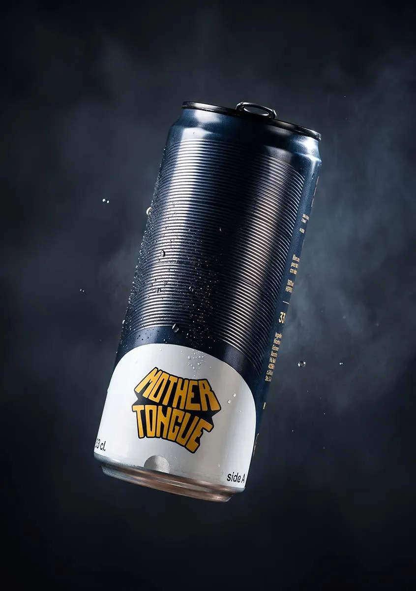
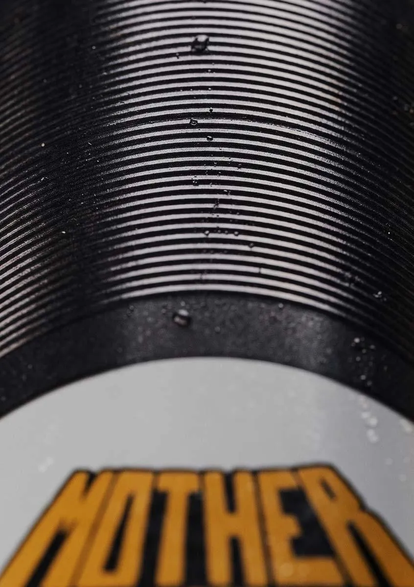
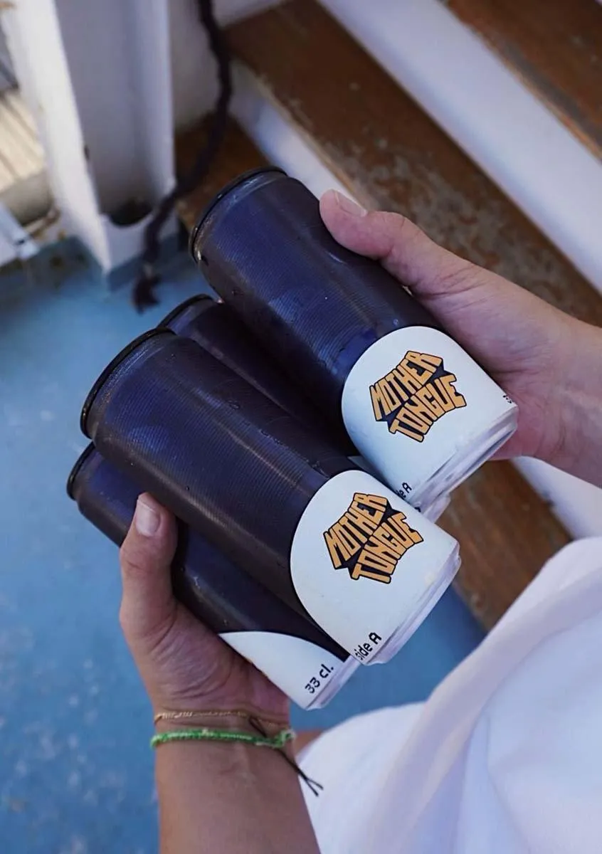
When they approached me with this project in collaboration with HOPS BY brewery, I was determined to design a beer can that resembled a vinyl record to promote what their business is. The process spanned several months as we explored ways to technically replicate the tactile feel of vinyl grooves on an aluminum surface.
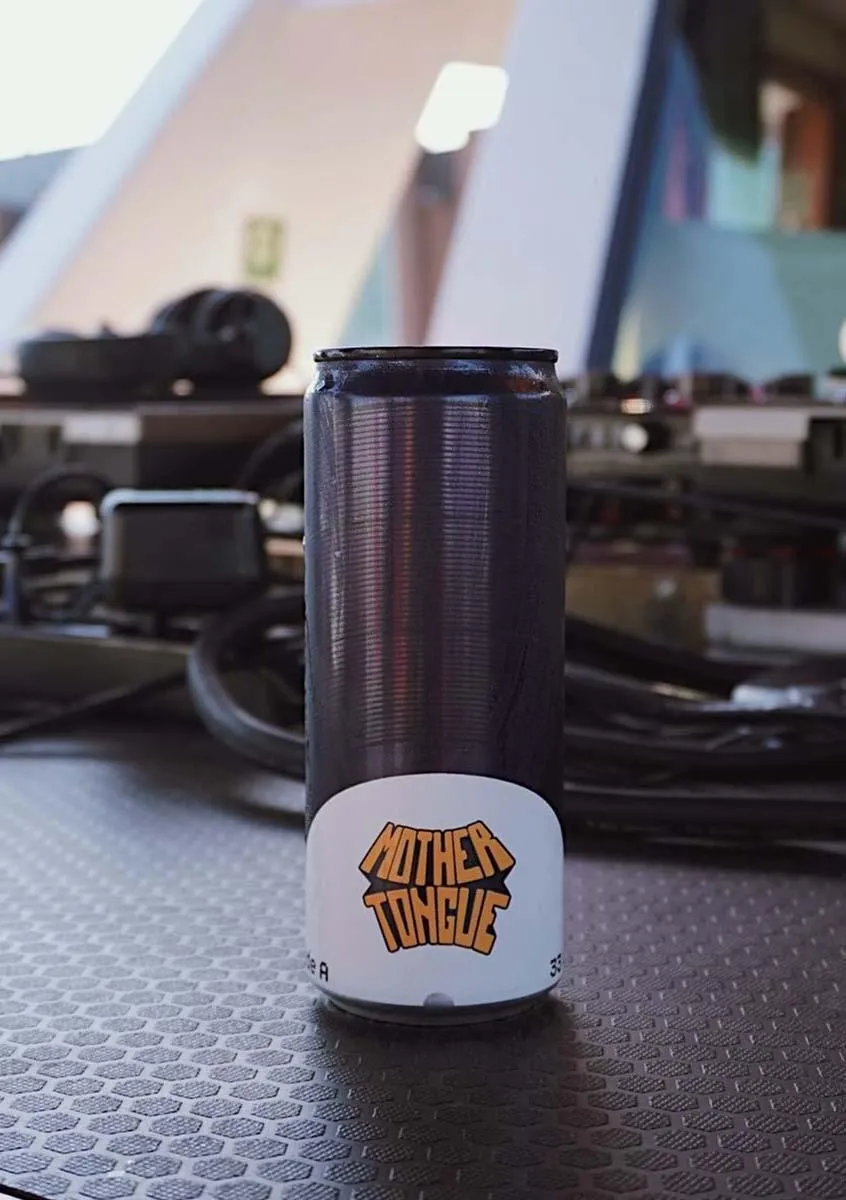
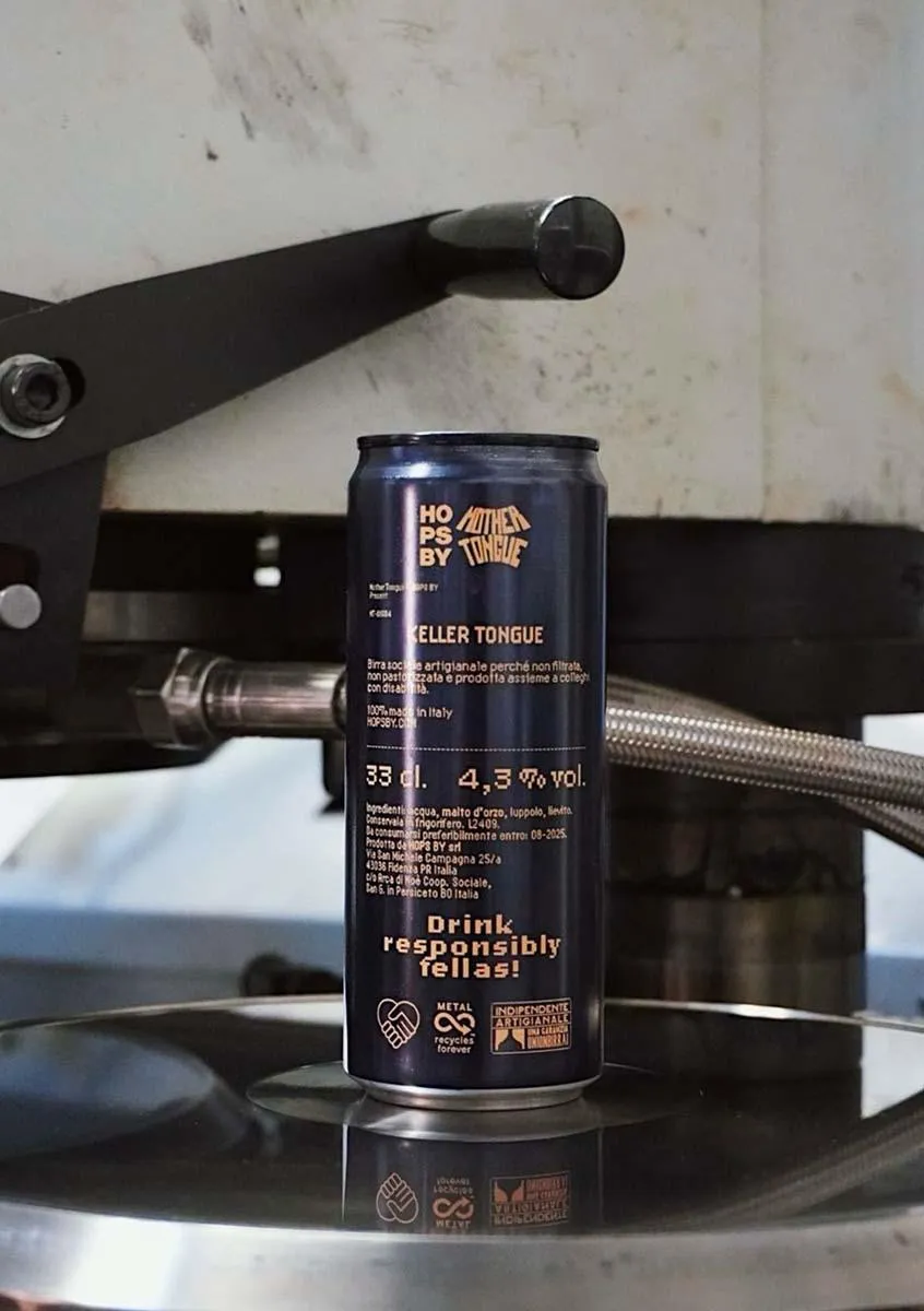
The final result is remarkably close to the real thing. The grooves catch the light depending on its angle — just like a vinyl record — and are also tangible to the touch. The classic vinyl’s sticker label is cut in half and shows the label’s logo. The back of the can features a layout inspired by a sticker I designed for one of their most successful release collections, staying true to the brand’s identity.
Originally, the beer was created for a specific event but has since made its way to local bars.
Info
- Client
- Keller Tongue
- Year
- 2024
- Work
- Art Direction
- Collaboration
- Mother Tongue × HOPS BY